Making the most out of Sky’s onboarding experience
TL;DR
The challenge
After buying Sky, new customers weren’t sure what to do next, and couldn’t create the Sky ID they needed to sign in to services.
What I did
Ran ideation workshops, then designed an interactive progress tracker with one clear next step, tested with a life-like Framer prototype.
The outcome
Around 86% of new customers now set up their Sky ID, up from 0%, with 59% engaging with My Sky and 50% with Sky Go.
Methods used
- Diary study
- Optimisation
- Usability testing
- Information architecture
- Card sorting
- Basic usability test
Many of our users struggled to know what to do next after purchasing Sky. Could they watch right away? What do I need for my installation? Where can they track their order? Do I have an account? I don’t remember making one.
All these questions and more needed to be answered and some of that was historically done through email. The problem was there was too many transcom emails that get sent out to new customers before they’re even set up. Another challenge involved Sky ID (Sky’s account management platform) creation, or lack of, because users were unable to create this at point of sale which was needed frequently to sign in to services such as the My Sky app, Sky Go and more.
Users were unable to create a Sky ID at point of sale which was needed to sign in to services
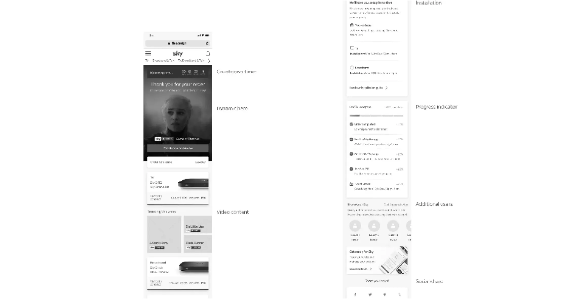
We decided to run a couple of ideation workshops with key stakeholders and sketched our ideas down as Crazy 8’s. Eventually we voted which ideas we liked best to take forward into low fidelity. At first it was a bit of a mash up of every idea on the page, which we found created a long and tiresome page but it proved useful when tested as one of the ideas, a progression tracker for next best actions, resonated well with our test subjects. They liked the idea of being shown what to do next and completing items in the checklist.
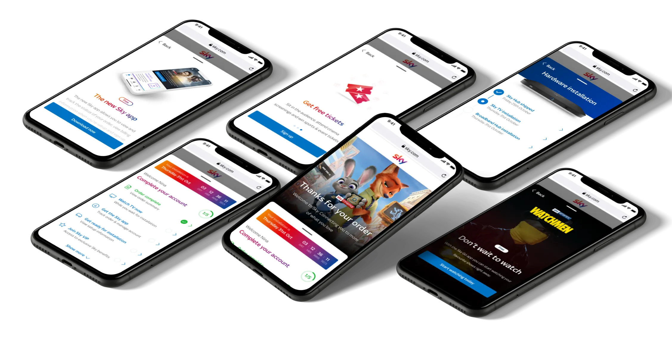
After reviewing these insights we sat down and sketched a few ideas, minifying the confirmation page back to just the progress tracker. We realised this allowed us to simplify the onboarding experience and provide users with a clear action we wanted them to take. The first action was to get users to finish setting up their account (create a Sky ID), as this was the most important. The second action was to download Sky Go, third the My Sky app, all without needing to leave the page.
This component would be flexible enough to update as and when priorities change and used across the site, in areas like My account once the user has navigated away from the initial confirmation screen. There was always a way to get back to it and there was a dedicated place for the user to go to to know what to do next with their account. In essence, making the most of their Sky experience.
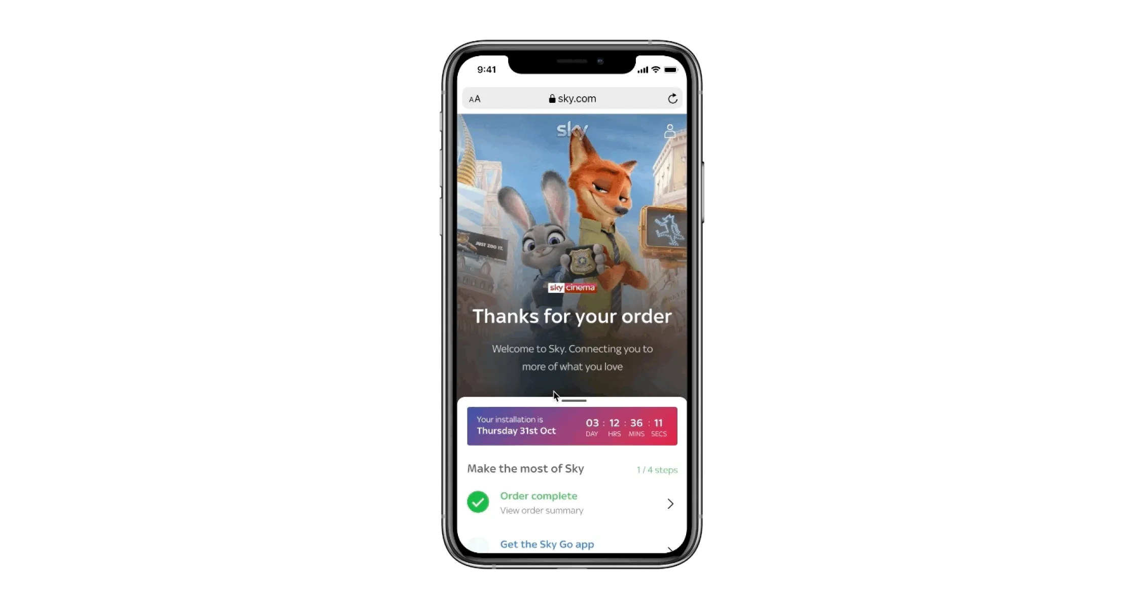
We needed to build a life-like prototype to test user behaviour
In order to keep the progress tracker interactive and keep the user engaged on the confirmation page we played around with a few different options, one was a traditional step by step onboarding method, but we felt this could get too tiresome when they’ve been through a lengthy journey. Eventually, we settled on a drawer that the user was able to action into view, play around with the different steps and go back to view what was next. Limiting the number of actions to around 5 to prevent cognitive overload.
We needed to build a life-like prototype to test the user behaviour with the interaction and we knew we needed something that felt native to the device. We built the prototype in Framer, this allowed us to create a seamless native-like experience with that wouldn’t be possible with other prototyping tools, either as static screens or railed animations.
Overall, it performed well. Users instinctively interacted with the progress tracker upon purchasing, it was clear and easy to use. Results following release indicate that around 86% of users were completing the Sky ID item, and around 59% and 50% for My Sky app and Sky Go respectively. This is up from 0% for Sky ID, 3.7% for My Sky app and 6.4% for Sky Go in earlier releases of the order confirmation page.
Core metric
86%
Engagement rate for Sky ID¹
¹from 0% prior to launch
59%
Engagement rate for My Sky²
²from 3.7% prior to launch
50%
Engagement rate for Sky Go³
³from 6.4% prior to launch